Does Color Matter in a Logo?
Of course color matters. No one would even begin to suggest it doesn’t. Color is an integral part of any graphic design project, and most particularly logos and identity work.
For example, this is how a logo design meeting often starts out…
US: So, what are you thinking for colors?
CLIENT: I don’t know. I really like RED. I mean, red is awesome.
US: Well, yeah, red is great, as colors go. But, why red?
CLIENT: Well, I just like it. It’s the best color.
US: But, you are, you know, a GREENhouse…you might want to at least consider green as a color.
CLIENT: Do you think? Well, maybe. But I don’t like green.
Okay, so that’s an extreme example, but not an uncommon one.
The temptation, for some people, is to use their favorite color for their company logo regardless of which color might best benefit the company. Surprisingly (I say with as much sarcasm as I can muster), the color that you want for your couch or car is not necessarily the one that you want to use for your company logo! I know, I know…much of our culture today is about what makes us happy or unhappy or threatened or scared regardless of what others might think. That may all be valid, but we can’t lose sight of what the choices we make as business people will say to the community and market at large.
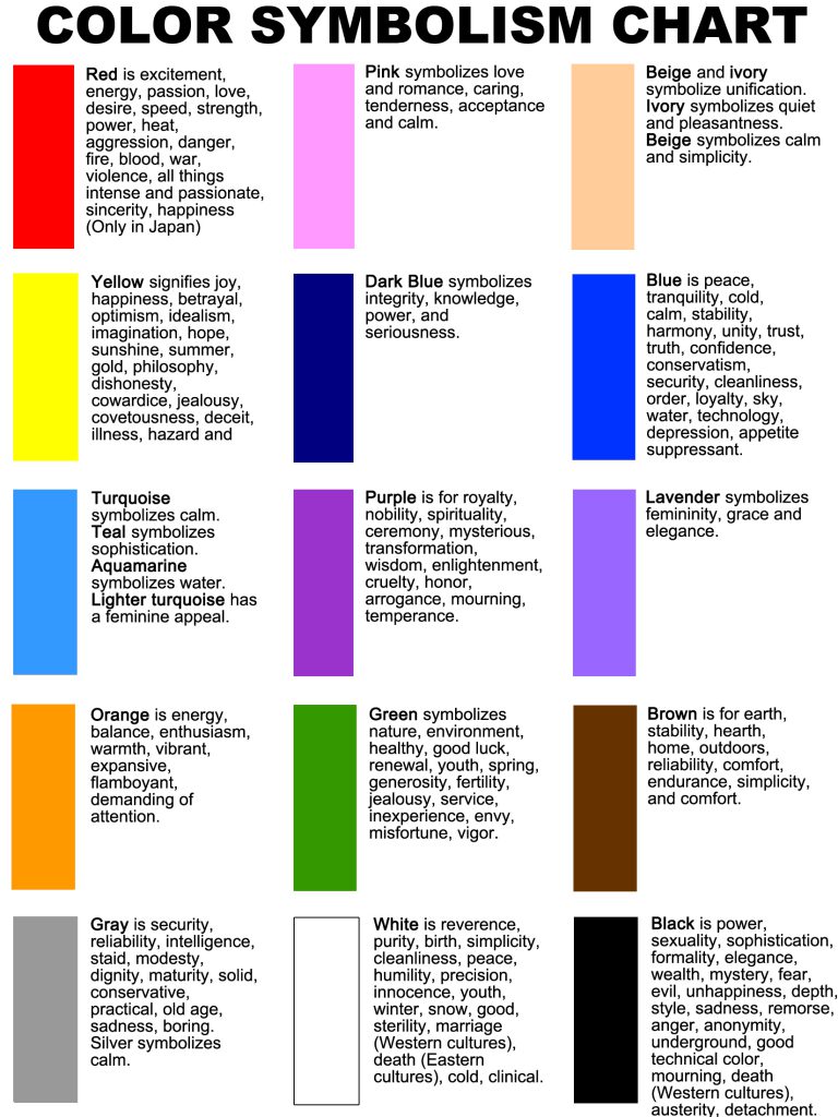
Color has symbolic meanings, just like shapes and words. Google the meaning of colors. It can be very useful exercise to learn what green means compare to blue or red. Some reference charts include cultural differences that are surprising to many western audiences. In China, red means good fortune and luck, while in The United States red means anger, fire, or passion.
When an agricultural company uses green for its logo, it’s an obvious statement referring to plants and vegetation. It’s not accidental when a business development organization or health group uses that same green to signify growth and nurturing.
Banks and financial institutions often use brown, not because they look like earth but because brown implies solidity and reliability. Gray has some of the same associations.
Orange is quite popular these days. Traditionally, orange means caution. Hunters wear orange, construction signs are orange. However, orange also implies a certain amount of freshness. We are based in Florida, and orange means citrus, sunshine, and refers to certain colleges. I had a client recently say that he will never have an orange logo as long as the University of Florida fields a football team. That could be a long wait.
Now, imagine a logo that has a leaf. Green is typical, and means growth and health. What if it were black? It could indicate death instead of life. And if it’s red or orange indicates autumn, which could mean the beginning of decay. Implications are important. Context can be everything.
Using the right color for your corporate identity, combining that with the right type face, can make a powerful statement about who you are and what you do. It’s not enough to pick your favorite color.

This color chart was adapted from https://www.incredibleart.org/lessons/middle/color2.htm, but there are many, many good examples to be found online. Be careful that you are looking at one that corresponds to your target market’s cultural orientation. You may be close but not quite right, or you could be wildly off the mark. It’s worth a look though, whether you are a designer or web programmer or sign-maker.

