Are you looking at a logo renovation disaster? Every now and again, an old identity element needs a facelift. Sometimes, companies feel their logos are getting worn out and old-looking, like a beat up sofa. At such times, they order a new logo to spruce up the company look and feel. Sometimes, it’s successful. Sometimes, it’s not so much.
I have seen a bit of this lately, so I thought I’d toss a few of the more famous ones out there and comment on them. I used to do a LOT of logo renovation for local companies. In their case, it wasn’t an issue of updating an older, successful logo to a newer one. It was usually updating to a new, professional logo from something that looked remarkably like Aunt Phyllis had drawn it at the family reunion–after sampling considerable quantities of adult beverages. The business owners would usually say something like, “Hey, it seemed like a good logo at the time–at the party–and we promised we’d use it…and I just felt bad because she had gout and all.”
I should dig out some of the worst of those. But, until then, here are these…
Kentucky Fried Chicken
KFC is all over the news lately not because of its logo but because it did a ham-fisted job of portraying the Colonel in commercials. Don’t be disrespectful to an icon! They did a better job with their logo. I like the bold graphical take on the older version. The Colonel looks more friendly and a little less like a creepy neighbor–wider smile, simplified hair swoop, and the addition of the apron makes him seem like an eccentric cook instead of an overdressed oddball.
Arby’s
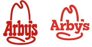
The Arby’s logo renovation isn’t dramatic and was done for more practical reasons than artistic ones. Granted, the loopy, curved typeface is out of date but it wasn’t a deal breaker. In fact, I am not a big fan of the new typeface…why is the serif on the A cropped that way? It’s idiosyncratic, but not in a good way. It makes me ask WHY not say WOW. Anyway, smallish point. I think the big thing is that the old logo is rectangular–tall and thin–which, from a design standpoint, is harder to manage and implement than a square logo. Note, too, that the color is more orange than red now. McDonald’s did a study years and years ago that found that the color orange increased hunger in many people. It isn’t accidental that most countertops and tabletops in fast food restaurants were orange for decades. Now, they are replaced by tans, solid wood, and granite. The food still tastes the same, which is either good or bad depending on who you ask!
Gap, Inc.

The Gap has an iconic, simple logo that looks great on storefronts and on clothes tags. Given its vintage, you’d expect it to be Helvetica rather than a serifed face. But, I really like the repetition of the mid-height lines. It’s perfect. Fast forward a bit and NOW you see the sans serif face you’d have expected years ago, but now in lower case. Even with this logo renovation there is no improvement with either of those choices. And you see a blue box. Sorta. What it’s doing floating there is a mystery. Perhaps it docked with the P. I don’t know. No one knew. So Gap folded up the logo and took it away just about instantly.
Electrolux

I am indifferent to the type change in this logo renovation. Honestly, I find myself drawn to old style serifed typefaces, so replacing with something sans serif is not really going to make me happy. But, an elegant sans face well spaced and weighted would be my second favorite. Of course, that wouldn’t work with that big symbol. The designer wisely reduced the size of the image to offset the lack of weight in the new face. The old face, despite having a lower x-height, manages to counterbalance the larger, heavier icon better than would the new face. All that said, I still cringe when I look at the icon itself. Am I the only one who sees a G-string through a peephole? Maybe. Sheesh.
Wendy’s
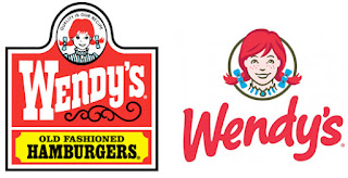
After Dave Thomas died, Wendy’s made some changes. The two worst changes were changing their fries to something that tastes a bit like salty cardboard and then skimping on their juicy burgers, which now seem a bit more like McDonald’s fare. From a logo standpoint, the change is positive. Simpler. A bit more dynamic. It’s a nod to the reality that “old fashioned hamburgers” is not really necessary to express in the logo. We all know what Wendy’s does. They did their logo well. Not so much my past few visits to the drive-through, though, sadly.
Starbucks

When Starbucks first made their logo renovation a few years ago, I was adamantly against it. I have to say that it’s kind of grown on me. Like Wendy’s, Starbucks is choosing not to say what they make, assuming (rightly) that we all know what they are all about. How can we NOT know since the distance between franchise locations in measured in yards rather than miles. Nevertheless, I have to confess that I rather like old fashioned emblem-type logos. I was never very good at making them, myself, so maybe that’s why. This is a one-color logo, so I suspect there was some cost rationale to this aspect of the change. All in all, it’s a a draw, at least to me.
Change can really make positive improvements on a business identity. Or it can destroy it. Any company has to be careful when doing a logo renovation to avoid alienating existing clients. However, should a change happen, it can be powerful and overwhelmingly positive.


