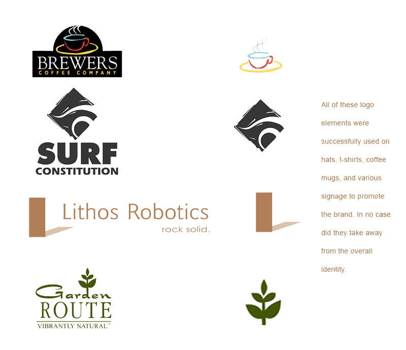
There are several schools of thought with logos and identity work. One school says you should only use your logo in its whole, pure and complete format. That means never dropping it into the background of a design, screened back. No cutting it in half to use it as a design element. And, if you have a cool element in it such as a bird or machine part or face, you can’t use that as a stand-alone piece. The other school of thought allows this. Logos usually contain, after all, logo elements and words.
What’s the big deal, you ask?
Well, the purists say that any use of the logo that is not complete and whole serves to dilute the brand. The idea is that the whole logo reinforces the brand while anything less than all is destructive.
That’s idiotic.
If you have a logo that has useful elements in it, USE them! I’ve used logo bits as the symbol at the end of a story in newsletters. Very effective because it not only stops the story but it visually refers back to the whole logo. Better still, it appears frequently in a publication.
Logo elements can be used to great effect on apparel
The graphical element of a complex logo (i.e. one with a graphical element and typographical elements) can be very effective and compelling. In fact, it can be far more successful than the entire logo. Using just a logo element can simplify the brand presence and make it far more memorable. Think Nike. In fact, think Nike and pretty much stop there. They’ve done this better than anyone.

Then take a look at Starbucks.

Even Dodge Ram is a well known element…

But it’s not just the big companies that can benefit from this kind of thing. Take a look at some smaller company logos. Some have local and some have national or even international reach. All are unafraid to use logo elements to make their graphical point.

In an era in which graphical flexibility is crucial to effectively navigating the myriad venues in which a logo might appear, it is a huge, huge, HUGE handicap to be hamstrung by the constricting rules of overly confining logo guidelines. I’ve worked in corporate settings with communications directors (it’s always communications directors, for some reason) who are married so tightly to the logo guidelines that they can’t break away from them. They act as though the logo guidelines were written in stone atop a stormy mountaintop and handed to The Administration (i.e. the communications directors themselves) by the gods.
In truth, logo guidelines are written by people who are less designers than they are administrators themselves as a way to exert control over any new bursts of creativity that might happen in the organization. It’s a remarkable duality: the creative guy makes a logo, jots down some rules, then tells other creatives that they can’t be creative after that point. Granted, there can be a big difference between a good design and a well-intended but horrible design. But, that’s where common sense and a good eye comes into play. You can’t legislate good taste, but you can encourage creativity.
Be creative. Break your own borders and design rules. Create logos with both logo elements and words. You will find new ones that lie just out of view. That is lively, interesting and reactive design. And that’s much more fun and effective than a stuffy rule book.

